Art Wiki – FAQs about abstract art
written by the art historian Dr. Ingrid Gardill
- Modern Art vs. Classical Modernism
- Katja Gramann’s artwork is abstract
- Abstract painting of classical modernism & precursors
- Abstraction or abstract art after 1945: informal art
- History of the collage technique
- Observations on Katja Gramann’s wax collages
- Delicate gestures and dancing colors – the free painting of the artist Katja Gramann
- Glamour Gems – a new series in Katja Gramann’s artwork
- Katja Gramann in an interview with the art historian Dr. Ines Kehl
- Bringing acrylic paintings to shine – the new series of “neon pictures”
- Abstract paintings with pigments and material in mixed media technique
- About the series of green abstract paintings “Bearer of hope” (Hoffnungsträger) in mixed media technique
1. Modern Art vs. Classical Modernism
Is there modern art? | What does modern art mean? | Modern Art vs. Contemporary Art | What is contemporary art?
Today people like to speak of modern art colloquially when referring to the art of the present . Modern is understood here as current, in contrast to old, antiquated or belonging to the past. Strictly speaking, modernism in the context of the visual arts describes classical modernism with the emergence of avant-garde styles . This corresponds roughly to the art and culture epoch from around 1910 to 1930. In America, the term modern also applies to the 1940s to 60s and is often shaped by emigrated artists from Europe.
Strictly speaking, our art today is referred to as contemporary in the cultural-historical discourse . Contemporary Art, the English term for contemporary art , is quite cumbersome, modern art is easier to pronounce. Perhaps that is why Modern Art was adopted from the vernacular into German as so-called modern art. Both terms, i.e. contemporary and modern, are often used in parallel and as synonymous to this day, However, the use of the term “contemporary art” to denote contemporary art is culturally and historically correct. The world’s best-known representatives of contemporary art include the German artist Gerhard Richter and the American artist Jeff Koons.
2. Katja Gramann’s artwork is abstract
abstract | informal | free
Which styles of classical-modern art can be found in Katja Gramann’s work? Katja Gramann is a contemporary artist and prefers to work abstractly , which means that she does not show any immediately recognizable objects, people, animals or plants in her art. There are many echoes of this, preferably in the depiction of blossoms or flowers, but they are always abstracted to such an extent that they can only be guessed at. This enables unrestricted, free viewing of her work. Basically, Katja Gramann’s art can be assigned to non-representational or abstract painting, within which she has developed her own formats such as free painting in acrylic, color field and gestural painting, which she implements in her mixed technique, and a special collage technique . But what exactly is abstract painting and where can its roots be found? What traces does Katja Gramann follow in her work and what is she inspired by? Let’s get to the bottom of the origins of this style:
3. Abstract painting of classical modernism & precursors
Romance | Impressionism | Neo-Impressionism | Expressionism | Constructivism | geometric abstraction | expressive abstraction
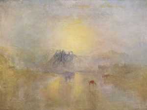
At the beginning of the 20th century, trends in art increasingly developed away from a recognizable representation of objects, space or nature. The beginnings of abstraction can be found predominantly in the art of Classical Modernism (approx. 1910-1933), which had its harbingers in previous art epochs: Interestingly, some painters began to work very early on To concentrate less on the concrete image of nature, for example, but rather to express moods. The main exponent and pioneer is the English painter William Turner , who was already active in the Romantic era (late 18th to mid 19th century). Impressionism and Neo-Impressionism followed this trail of fleeting snapshots in France since the mid-19th century. It often reproduces the impressive lighting mood we know from the paintings of Claude Monet.
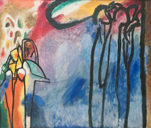
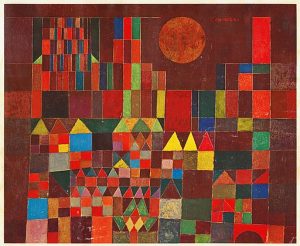
Having arrived in Classical Modernism, it was the representatives of Expressionism in particular who pushed the approach even further. They experimented with transcending color. In other words, they expressed their feelings directly in the color scheme, while the recognizability of the subject matter took a back seat. Franz Marc, August Macke, Paul Klee and Gabriele Münter are some of the representatives from southern Germany. Wassily Kandinsky , who is also one of them, has certainly taken abstraction the furthest, especially in his later work. However, like Paul Klee, he often “hid” motifs that were still recognizable to the trained eye in the picture.
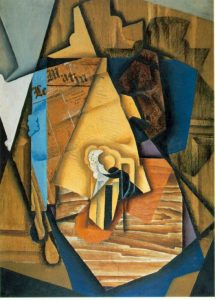
On a second level, painters of Classical Modernism developed their art in the direction of abstraction , namely by breaking up the form. Although this can also be found in Expressionism, it was the main concern of the Cubist artists, which developed in France around 1900. Among them are above all Pablo Picasso and Georges Braque . Here is perhaps the most radical departure from all rules and conventional principles of representation: the dissolution of perspective (here, however, it was Paul Cézanne who turned away from it), the three-dimensional illusion, the coherence of the image order and proportion, in favor of a breakdown of values and Balance of power. The objects often appear to be tilting or “unfolded”, which is why one speaks of two- dimensional space. The aesthetic reinterpretation of the form gave the artists enormous freedom on which later generations could build. Picasso himself quite deliberately never ventured into the terrain of complete non-representationalism.
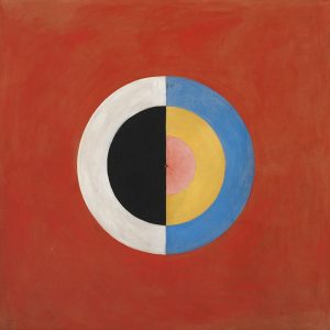
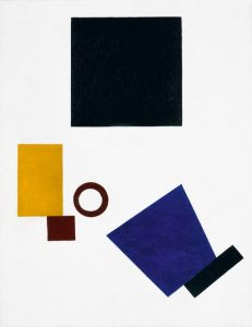
Based on the latest findings, it was a woman who painted the first really abstract picture : the Swedish artist Hilma af Klint . Inspired by the spiritualist currents of her time, she painted non-representational as early as 1910 in order to capture the mentality in her pictures. While her work remained hidden until recently, it was the Russian painter Kazimir Malevich , the main exponent of Constructivism , who publicly exhibited the famous “Black Square” in 1915, which soon became an icon of modernism. The breakthrough for abstract painting with its renouncement of image concepts was created and from here on – on this basis and following on from Classical Modernism – various styles within abstraction began to develop. In retrospect, they were roughly classified into a geometric abstraction (Kasimir Malewitsch, Piet Mondrian) and an expressive abstraction (Paul Klee, Wassily Kandinsky).
4. Abstraction or abstract art after 1945: informal art
4.1 Development in Europe: Realism | Informel | geometric abstraction | lyrical abstraction | gestural painting | ZEN 49 | Group ZERO
After the Second World War, the aim was to find an artistic detachment from the realism-related aesthetics of National Socialism in a destroyed Europe. Abstract painting offered itself as politically “neutral”, liberal and progressive . A socially critical message was not aimed for, the turning away from representational painting in relation to the past was statement enough. With informal art , or Informel for short, an artistic attitude was defined that included diverse directions of ” formlessness “. The term was coined in Paris in the 1950s, originally as a counterpoint to geometric abstraction . The great role models were the paintings of Paul Klee and Wassily Kandinsky, but one also saw oneself in a long tradition with the atmospheric, abstract water lily pictures by Claude Monet. Therefore the artists of the Informel are also called artists of the lyrical abstraction , in contrast to those of the geometrical abstraction. The pioneers of Informel include Ernst Wilhelm Nay, Fritz Winter, Willi Baumeister, Rupprecht Geiger, Hans Hartung, Emil Schumacher, KRH Sonderborg, Karl Otto Götz and many more. Often they worked with spontaneous gestures and intuitively placed signs, which they either left as they were or integrated into a larger composition. This is why the term gestural painting is often used. Some representatives in southern Germany joined the ZEN 49 group, while the ZERO group was formed in Düsseldorf, looking for an aesthetically unencumbered new beginning in the “zero hour”.
4.2 Development of abstract art in the USAabstract expressionism | Action Painting | Drip Paintings | Color field painting | Black Paintings | Expressive abstraction | New York School
In the USA, a comparable trend within abstract painting, abstract expressionism, developed as early as the 1940s. Intuition and feeling, which were given direct expression, were predominant here, before any structure and any perfectionism. The artists who immigrated from Europe and defamed as “degenerate” in Germany shaped this art concept in America, especially Josef Albers and Hans Hofmann , but also the French Yves Tanguy and the Dutch abstract Piet Mondrian .
Different forms soon developed: Action painting , a quick, spontaneous painting, attracted attention primarily through Jackson Pollock’s drip paintings , for which he dripped or hurled paint onto a large canvas lying on the floor. At the same time, Mark Rothko, Clyfford Still and Barnett Newman , among others, practiced their color field painting. The works of Mark Rothko, created from 1950 on, are considered the first works of color field painting. Large-format and multi-layered, the monochrome-modulated colored surfaces blur into one another. The artist wanted an intensive, also meditative view of his painting, focused on the pure effect of the colors. Painters like Cy Twombly , like Helen Frankenthaler or Willem de Kooning , are also among the main exponents of American Abstract Expressionism. But his filigree technique, which applies handwriting gestures like casual scribbles to monumental formats, has in turn produced a character all of its own. The repositioning of American art at the end of the 1940s was also evident in the Black Paintings , a series of monochrome pictures in black and shades of black, with which one parted with European tradition and its influence. For artists like Robert Motherwell, Ad Reinhard or Frank Stella embodied the Color black is the core of the expressive abstraction. The mention of the color black as an ideal in Theodor W. Adorno’s posthumously published aesthetic theory “The ideal of black is in terms of content one of the deepest impulses of abstraction” (Adorno 1974, p. 65) is interesting.
American female painters of this time often developed their own artistic forms of expression and sometimes had to assert themselves as wives at the side of famous painting colleagues. They belonged to the first generation of Abstract Expressionism painting, especially the New York School , and had a great influence on the art of the time. Particularly noteworthy here is Lee Krasner , who painted or collaged spontaneously and intuitively, often directly on walls. She was married to the action painter Jackson Pollock. The large-format color field painting by Helen Frankenthaler . Elaine de Kooning , married to Willem de Kooning, found the figurative within her loosely set color painting after 1950. Joan Mitchell belonged to the second generation of the New York School and impresses with vibrating, rhythmic gestures in powerful colors, which she placed spontaneously over one or more large-format canvases, especially in her late work.
5. History of the collage technique
The historical avant-garde used the artistic collage technique (from French coller, glue) as a method of alienation . Its origins lie in French Cubism and Dadaism around 1910/1920 , where the artists tore up newspaper clippings, photographs and colored paper and stuck them together on a surface. This was particularly beneficial to the conscious breaking up of the form and the aperspective montage of Cubism. The Dadaists also wanted to disrupt the conventional understanding of meaning and used the technology primarily as a form of protest . Hannah Höch was the first to discover photomontage . Foreign materials, smaller objects from the everyday world and other set pieces were also glued together. For the first time, the artists experimented with foreign material and designed rhythms, exciting surfaces or content-oriented compositions in this innovative way. At the same time, they used the décollage , tearing out, loosening or scraping off materials, the structures that were created intentionally or by chance. The visualization of what was below was used as a stylistic device and was practiced in the 50s and 60s of the 20th century, especially with the billboards glued in many layers. Representatives of the surrealism of the thirties, pop art of the 60s and 70s, the flux of the 70s as well as the copy and mail art of the 70s to 90s used the collage technique in their own specific way.
Even if Katja Gramann’s collages have their origins in the tradition listed, they go beyond the classic technique and at the same time incorporate the idea of décollage. The artist discovered a completely new type of collage by gluing, on the one hand, self-colored, very fine paper and literally painting with it. In addition, she creates spatially exciting compositions by subsequently peeling off and blending foreign material and pigments. These appear tightly packed or as light, floating formations that are made soft by a subsequent wax coating. Often the collage in Katja Gramann’s work can be more guessed at than one can see what makes it very special. From very small to large, often unusual formats, the artist masters this technique with virtuosity.
6. Observations on Katja Gramann’s wax collages
by Dr. Barbara Rollmann-Borretty
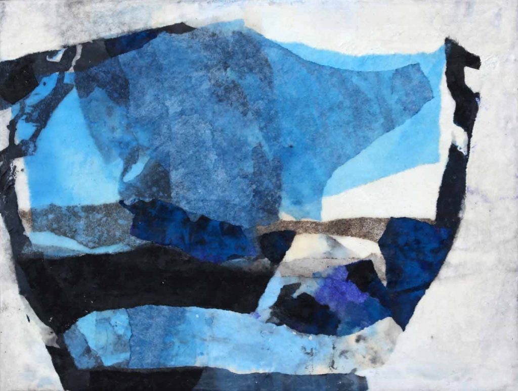
The black holds everything together. It surrounds the blue in rough, angular bars. The blue that hovers in uneven fields between the stripes, and that is not just ONE blue. From the dark shimmer of the lapis lazuli to the transparent turquoise of the cleanest sea, every field has a different tone. And where they overlap, another nuance appears. The colored areas are not set according to any rule and could easily shift in their looseness. If it weren’t for the invincible black. And if it weren’t for the dense stock, which is broken white like a paste made of marzipan and offers a solid hold. Everything in this picture is arranged according to the law of dramaturgy. A game of aesthetics and expression about the optimal balance of power, which still works out of the lightness of chance. The use of pure color qualities directly supports the development of the sensual world of emotions. The complete absence of the representational inspires an elementary and high-contrast visual language – that was already to be learned from the great masters of Art Informel .
No picture is like the other. But our imagination can link each with both the smallest and the largest world. It doesn’t matter in which format a work is created. The associations oscillate between micro-structures made of crystals and real existing objects to fictional skyscapes. The collective consciousness is stimulated to remember. The most expressive images are well classified using the archaic concept of style . With them, the topic of stone and crystal is omnipresent. A dominant element are the large areas of angular blocks of color that stand in a vertical position like a rock massif in a primeval landscape. Similar formations can be observed in modern stage sets if they were conceived for dramas from ancient times.
Katja Gramann composes her wax collages using a very elaborate technique . The many work steps begin with the construction of the fund on the picture carrier. When coloring the collage paper, usually Chinese paper, the dissolved color pigments are applied to the stacked paper, whereby they seep down to the lowest layers – this results in different saturations of the color shade by itself. After drying, the artist tears pieces out of the arches by hand for the image design. A process in which she lets herself be guided by the random pattern of the color applied. This creates the irregular fields that are so important for the character of the collage.
After arranging and fixing, the papers are gently coated several times with melted wax. It takes a lot of sensitivity and patience to achieve the transparent and yet hermetic coating that is so typical of the wax technique. The result is an abstract pictorial space with a certain depth that is built up layer by layer. Aware of this fact, the artist occasionally still carries out final interventions. So she makes traces in the final wax by scratching a rudimentary drawing. The columns are then filled with charcoal and thus emphasized.
Katja Gramann has only been working in this technology for a few years and has brought with her an amazing feeling for the matter . In the prehistory she had painted a lot in watercolors. Parallels can be seen: for example, the structure in transparent layers of paint and also the stylistic means of unevenly overlapping edges, which in the case of watercolors originate from the brush application, in the case of collages from tearing. Above all, both techniques require work to be carried out in minutes, in which the artist must follow her intuition decisively and precisely. The wax with its changing aggregate states is more than a malleable substance. Its cultural significance and symbolic power always play a role in artistic work. Katja Gramann has found a convincing visual language for herself.
© 2017 Dr. Barbara Rollmann-Borretty
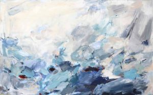
7. Delicate gestures and dancing colors – the free painting of the artist Katja Gramann
by Dr. Ingrid Gardill
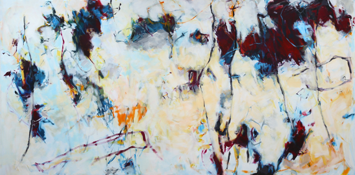
The abstract, large-format works from the new series of works by the painter Katja Gramann leave a strong impression on the viewer. Why is that? In my opinion, this is because the artist not only succeeds in making her strong colors, mostly created in acrylic, literally shine , but also in giving her compositions an extraordinary lightness at the same time. She achieves this through the open, filigree and yet decisive setting of the forms .
Those forms emerge from the multiple layers of the light background or shine through in places. This creates special color moods and a fine transparency . On this delicate fabric, Katja Gramann uses lively, powerful brushwork to set bright accents , mostly in a targeted combination with black. The tension that emerges from this conceals the strong energy that the viewer perceives consciously or unconsciously and that helps to clarify the initial question.
But let’s take a closer look at the diversity of these lively structures . It gives the impression that they are dancing. Everything is in motion and at the same time connected to one another, is wild and yet clear. Appearances of floral motifs (enchanted, second spring, time travel) can finally merge completely abstract into pure color tones. The artist occasionally inserts lively lines that, comparable to bar lines, add rhythm to the works . They give the shapes and also the eye of the beholder support. At the same time, they appear almost like lines of life. But Katja Gramann also breaks away from this from time to time and simply lets the color structure work by giving them a great depth through accentuations (soul view), the view of a background (easy courage), or by opening up a room (eye-catcher).
After all, why do Katja Gramann’s permeable pictorial grounds with their delicate gestures make the beholder’s strings ring so strongly? Similar to the wax work, the somewhat foggy shining through, as if coming from another world, opens up a space for fantasies and wishes . We know this special space or state from our own experience: When we slide over from the dream world into waking consciousness and vice versa. This moment can be found in almost all of the artist’s works. Katja Gramann captures it with the apt term of the dream catcher .
Indian dream catchers are light, net-like objects, drawn through with feathers, colorful cords, pearls and all kinds of jewelry. Suspended above the place of sleep, only the good dreams should be able to slip through, while the supposedly bad dreams are held back in order to dissolve in the morning light. One of the artist’s works is entitled Dream Catcher. It shows moving lines and color fields on a light background, which in turn is permeated by light and nuances of color. The painter gives this “fabric” a deliberately diffuse appearance and thus reminds us of this special state between dream world and waking consciousness.
“Dream catcher”, dimensions: 100x200x4cm, 2016
This principle is fully applied in “Zündung”, Katja Gramann’s most recent work. Here the permeable ground is defining. The painter only occasionally inserts traces of delicate black lines in neon orange and pink into the upper area of the picture and lets them dance like sparks of fire.
Katja Gramann’s exuberant joy of discovery and her great pleasure in free painting have also recently unfolded in other works in which she brings her color accents almost full-format. With pigments and a mixed technique of Rus, sand, ash, paper, charcoal and other materials that create delicate structures on the surface of the picture, she creates light (archaic) or strongly colored (opinion, rendezvous) formations that challenge themselves into the picture push. The courage to use expanding, almost monochrome colors with a sensitive background at the same time is what characterizes these strong images.
The principle of the dream catcher as an aesthetic statement by the artist also applies to this series of works: Katja Gramann’s free, abstract, ultimately informal painting leads to works that speak to many things. But just as when waking up from a dream, the contents can never be grasped specifically and completely. In this way, longings, ideas or even unconscious slumber can flow in. This offers every viewer the opportunity to have an open and inspiring dialogue with the artist’s fascinating works.
© 2017 Dr. Ingrid Gardill
8. “Glamour Gems” – a new series in Katja Gramann’s artistic work
by Dr. Ingrid Gardill
Further development of the collage technique
In times of the pandemic, Katja Gramann developed an new direction in her art. To counteract the general dreariness – also for herself – she has started to make her already powerful color palette shine even more. Completely new works were created, developed from her own technique, which has now become one of her trademarks – the collage.
She was inspired by the brightly colored, wafer-thin papers in her studio, which she colors herself, tears into pieces and uses together with other substances for her collages. Eventually she started to experiment with the papers and colors and finally developed a new technique.
Professional handling of the interplay of colors
Now she uses the paper as a whole and dips it in different colors. The consistency of the color scheme is essential. The process results in moments when colors run into one another as well as special structures where the paper is only slightly saturated. The act of dipping and withdrawing the sheet of paper must be done at exactly the right time and with the utmost precision to achieve the desired effect. Katja Gramann herself speaks of “managed coincidence”. This is where the artist benefits from years of experience in the professional use of color. The process can succeed immediately, or the result must be discarded. There is no in between. This is what makes the one concentrated moment so essential.
Art-historical tradition
American action painting artists had a similar experience in the 1950s and 1960s. The act of pouring paint, dripping, dabbing or painting took place in the highest concentration and at the same time spontaneously and intuitively and with lively gestures. European artists showed a comparable stance in the mid-1950s with informal painting – also known as Informel – when the aim was to free themselves from the principles of classical composition and to help color achieve its autonomy. Here, too, it was the trace of movement in one moment on which the act of painting concentrated.
The targeted dipping and coloring of paper in order to then apply it in a conscious action as a collage on a wooden body, as Katja Gramann does, in turn points in its own direction that goes beyond painting. But the creation process of the new series of works and their appearance are in the tradition of informal art.
Consistency of the structure
It is also important to make the right decision when gluing to the wooden support. The artist has to keep a close eye on the tense composition and determine which form and color moments on the sheet belong to which place in the picture. A subsequent correction is not possible. However, the composition does not end at the edges of the picture, but is glued across them to the edges of the back. This creates new arcs of tension.
The continuation of the picture around the mostly 6 cm thick picture frame allows the small-format collages in particular to appear like three-dimensional wall objects or bodies that draw the eye to the surrounding color gradients.
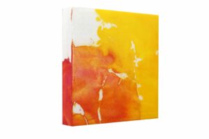
Breaking forth of the light
But the trick is that Katja Gramann finally covers the collage bodies with casting resin. The resulting smooth, slightly reflective surface means that both the luminosity of the colors and the depth effect of the compositions are further increased. The gloss makes the colors shine. In contrast to her very delicate collages covered with wax, the artist finds the opposite, but equally grandiose effect here – that of intense glow from the depths.
© 2021 Dr. Ingrid Gardill
9. Katja Gramann in an interview with the art historian Dr. Ines Kehl
Dr. Ines Kehl: Dear Katja Gramann, how did it all start, how did you get into painting?
Katja Gramann: My parents recognized early on that I like to paint a lot and when I was 12 they gave me a watercolor box with seven colors and the corresponding course at the adult education center. And then I went there every week – as the only child among so many seniors (laughs). But that didn’t really matter at the time – nobody was surprised. And I learned to mix colors with my little box – I still benefit from that today. It was only when I moved to Berlin for work after completing my studies that I got to know large-format acrylic painting in the painting school of the artist couple Jürgen Sage and Astrid Albers. Before that, I only did watercolors.
Dr. Ines Kehl: How formative was your time in Berlin?
Katja Gramann: Berlin appeals to every artist’s soul, because the city is so colorful and chaotic, a lot is on the move, the energy in the air is almost tangible and at the same time everything is quite relaxed – it’s a terrific mix that simply invites you to be creative to work. In Berlin I realized that art is and will be an essential part of my life. The lessons in Astrid Albers and Jürgen Sage’s painting school contributed a lot to this. There I was accompanied wonderfully artistically. I learned an enormous amount from dealing with both of them on a weekly basis. Even after I had been in Munich for a long time, I was looked after by them via telephone and internet. I had and still have a very high level of trust with both artists. Unfortunately Jürgen Sage passed away and I have sporadic contact with Astrid.
Dr. Ines Kehl: You have been in Munich since 2003. It is not so easy to rent a studio there, where did you paint or where do you paint today?
Katja Gramann: In Munich Pasing I was able to rent an old, rather dilapidated, former and small schnapps distillery across the courtyard – for very little money. It was terribly drafty and cold there, in winter I could only paint with gloves, but it was a room just for me. And precisely because it was so shabby, I was able to pour my colors onto the canvases to my heart’s content without thinking about dirtying too much – perfect for me! We have been living in Graefelfing since 2010 and I can work in my own workshop in the house.
Dr. Ines Kehl: Have you never regretted not having studied art at university?
Katja Gramann: I’ve already thought about it, but at the age of 20 I didn’t have the courage to do so, because life as an artist is usually quite hard – very few can live from art alone and I have alternatives no thought back then. So I decided to study German language and literature and history – it seemed to me to be less unemployed at the time (laughs). And now I am the person I am through everything I’ve experienced and happened to me, and that includes studying at university in a completely different discipline. In this respect, I don’t regret my career.
Dr. Ines Kehl: But autodidacts have a much harder time in art than qualified artists, although they are sometimes the more creative or freer artists.
Katja Gramann: The thing about “having a harder time” is of course correct and I can tell you a thing or two about it, because if something runs through my life, it is being an autodidact. For example, I studied German and history, but then worked in marketing and product management. I was the only humanities scholar in every company I worked for. And as a product manager, I started taking photos and painting in large formats and then started my own business after the birth of my children. Self-taught people usually bring a lot with them, because besides what they are currently doing, they have experienced, done and studied completely different things. And all of this that still resonates in experience flows into the work of an artist somewhere. From there, I have no problem with my autodidact.
Dr. Ines Kehl: And how do you continue your education, do you also do it on your own?
Katja Gramann: A lot comes about through trial and error. And then I keep taking seminars at the independent art academies in Bad Reichenhall and Augsburg in order to develop myself further and to learn new techniques. The exchange with the artist and lecturer Andrea Rozorea in particular helped me a lot artistically. Today we often meet in pairs in Andreas’ studio in Augsburg to paint together. That is really great!
Dr. Ines Kehl: Where do you get your inspiration from? How do you get the ideas for your abstract paintings?
Katja: Artists often perceive their environment to be a little different. For example, I can enjoy it when the rest of the beetroot juice on the already empty salad plate runs into the dark brown balsamic vinaigrette, then I think to myself “What a play of colors, I’ll try that too”, or I blink with my eyes, so that everything around me becomes slightly blurred – then everything becomes just color and shape – and I then try to implement this abstraction in a painterly way.
The interview was conducted in February 2016.
10. Bringing acrylic paintings to shine – the new series of “neon pictures”
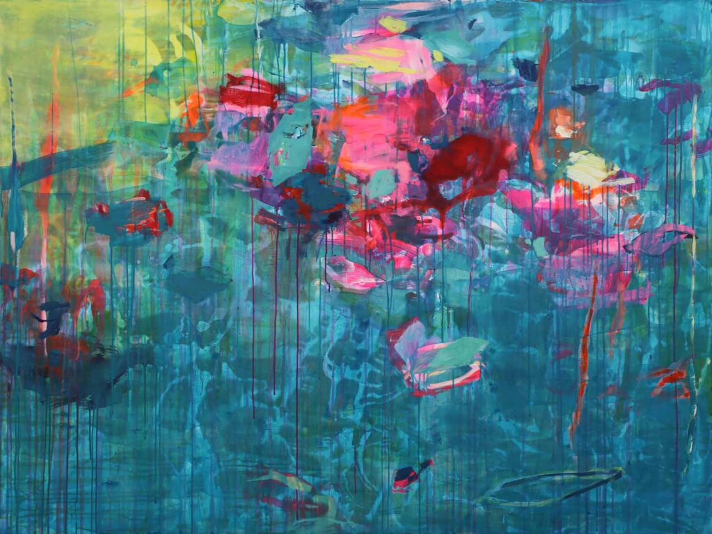
The titles already expresses it – Quiet was yesterday – Full of life – Delighted joy – Life is delicious – Come play with me – I’ll be gone –our time is now– cheeky, full of vitality, brisk and at the same time playful and light-footed comes the new series of works by Katja Gramann therefore. It is a burst out, a “painting against the sadness of the time” as the artist herself says. The works in acrylic with their bright colors that were created during the high phase of Corona in 2020 and 2021 indeed don’t leave anyone in an unhappy mood.
Katja Gramann remains in her glazing technique and builds up on it. She creates the images in many overlays and brings transparency to the individual layers. She allows drops to form from the watery color substance that make their way across the canvas. Her signature can also be seen in these abstract compositions: the depth effect, the targeted setting of lively color accents, the courage to dare to try something new. She visibly enjoys experimenting with highly pigmented, fluorescent daylight colors, but still requires a certain amount of discipline, because too much would destroy the work and make it appear flat. The secret lies in the sensitive combination of delicacy and color strength. In the process, compositions are created, each with its own character, which Katja Gramann lures out with her usual instinct.
Neon colors were first experimented with in pop art in the 1960s. It signified a new departure that left the previous conventions behind. Everything was allowed now and the artists from the USA and Europe really let off steam. Andy Warhol’s screen prints in particular made use of the glaring glow and set the contrasts hard against one another. In doing so, he also turned away from abstract expressionism and, like Roy Lichtenstein, helped objectivity to a new appreciation.
The abstract color explosions in Katja Gramann’s neon series, on the other hand, allow the colors to flow into one another. This is also shown by her “Glamour Gems”, a recently created series of works that builds on her collage technique using strong color pigments and finally seals the image carrier with resin. The consistently large-format acrylic paintings of the latest series, however, remain open-pored and thus go a little further in their life-affirming effect.
© 2021 Dr. Ingrid Gardill
11. Abstract painting with pigments and material in mixed media (mixed media)
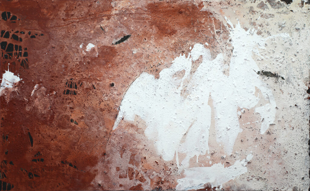
These informal images ground and lead to peace! They are authentic and honest and are particularly inspiring because of the material used. The artist Katja Gramann perceives the earthy energy of the mixed media images as a kind of antipole to the digital and artificial that predominantly surrounds us today. This is why she has recently been making increasing use of this technique, which she has been using again and again for many years. She firmly believes that not only she but all people need this type of art.
Mixed media with predominantly natural materials
It is a mixed media technique in which mostly natural materials are used. For example, ash, rock flour, sand, pigments, wax, paper, coffee, charcoal and much more are applied in layers, some of which are poured. The thinly mixed color pigments flow with the materials, form bonds or settle. The result is therefore always surprising after drying, because it can only be planned to a certain extent.
It is important to Katja Gramann that the work is and remains open-pored , because the paint is powdery. This lets the works breathe, makes them permeable, even though many individual layers of color pigment are laid on top of one another. Often the artist then goes over it with a charcoal pencil, or she scratches accentuating gestures into the picture with a spatula or a scoring needle, so that the underlying ash or different colored layers of pigment break up again. This creates a relief-like, sometimes quite rough structure that brings great tension to the picture. As in the tradition of informal painting, the material is also in the foreground here.
The ash used has a different color depending on the type of wood burned. The spectrum ranges from white-gray and brown to very dark gray-black. Once used, the ash shade can never be completely removed from a work, because the ash always slightly stains the other pigment layers and “bleeds”, especially with white tones.
Gramann uses ashes from her friends or family’s stoves, or she picks them up from the grill stoves of the various campsites where she stopped during vacation trips. She is particularly fond of the ashes from the forge of a local blacksmith who makes the heavy metal frames for the mixed media work especially for the artist. When picking up the frames, she became aware of the fine ash and was allowed to take it with her.
Great variety within the series
What is exciting about the series of works is that the works show a completely different effect . There are extremely delicate compositions such as Weissheit, Lichtfeld, Stille Kraft 1 and 2 or Knossos , in which there is a lot of liveliness and whose colors are rather subdued. Powerful designs such as inner growth, flash, elementary, it remains exciting, layered work or metamorphosis , on the other hand, have a dense pigmentation and dominate the format with their sheer unrestrained colors or deep blackness. Sometimes dense and sometimes punctiform, always keeping tension, the painter plays with the various pigments here.
Earthbound and archaic
The wooden picture carriers allow Katja Gramann to scratch and damage the surface. This is important because she expects a lot from the material when she is working process-oriented and with lively energy. The great love for stone and its different flours, for organic, natural materials allows her to create new things again and again with enthusiasm.
The archaic moment , as we know it from the cave paintings, for example, plays a role here. The abstraction, which is implemented in a very comparable way in informal painting, comes to the fore in the works of Katja Gramann. Even in the color nuances, archaic and earthy elements play a major role, as the earthy-looking, so far eight-part series Erdverbunden 1-8 clearly shows.
So there will always be surprises when the artist delves into working with pigments. New and daring things are explored, as in summit climbers or clarification , while earthly connections always bring you back into peace. Depending on the mood and spirit of discovery of the artist, this series of works will continue to have a lot in store that will amaze us.
© Dr. Ingrid Gardill, January 2022
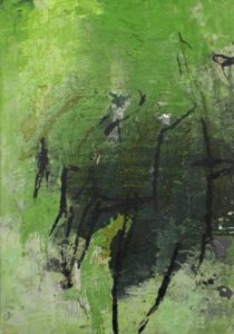
12. About the series of green abstract paintings “Bearer of hope” (Hoffnungsträger) in mixed media technique
“I want to make the green a hero”
The new series of works “Bearer of hope” (Hoffnungsträger) by Katja Gramann
Prehistory
Katja Gramann calls her current, extensive series of large-format, abstract material paintings in mixed media, which she has been working on continuously since July 2023, “Bearer of hope” (Hoffnungsträger). The starting point was an intensive exploration of the color green. The initial impetus for this came from her gallery owner in Belgium with a photo of a weathered quay wall painted by nature, which reminded him of typical works by the artist. For Katja Gramann, the impulse set in motion a thorough, both artistic and theoretical research project.
She asked herself why there are so few role models for the color green in art history. She found what she was looking for in Cy Twombly and Emil Schumacher, who, however, often did not use the color as a solitaire. Neither did Claude Monet, whose water lily paintings contain a lot of green, but Katja Gramann has recognized that we do not really perceive the color there, but mainly the blue also contained in the paintings. – Why is that?
“Outcast” color
If we look at the historical context, we soon realize that the evaluation of color has obviously shaped our viewing habits over several centuries. In Leon Battista Alberti’s treatise “Della pittura” from 1435, green was still one of the four “true colors”, while in the writings of the 17th century, the triad of green, blue and greenish was still used. The fourth main color, green, was gradually degraded to a secondary color. The Swiss art historian Felix Thürlemann investigated this phenomenon of increasing ostracism, which ultimately culminated in the “color purism” of modernism. The author sees the cause of this evaluation as early as the painting of the European Middle Ages. In somewhat simplistic terms, green was symbolically assigned to the earthly realm, while the primary colors were primarily reserved for the heavenly spheres. Incidentally, this is still reflected today in the use of liturgical colors for church services: green denotes all the days of the church year without a feast.
The three-color theory was not questioned later and had developed into a dogma in classical modernism, particularly in the teachings of the Bauhaus and the theory of abstraction. Thürlemann aptly summed up this tendency from around 1910 onwards in his essay: “Green is the color of the lower, naturally real realm; it stands in contradiction to the sublime world of the ‘pure abstract'” (p. 23)! In 1912, Wassily Kandinsky made the corresponding derogatory comment that green had a passive, motionless, indifferent and boring effect (p. 94 f.).
Experiment
With her abstract art, Katja Gramann consciously broke away from this traditional and highly judgmental genesis of color. She began to experiment herself and bought an extensive palette of green pigment tones to create her own colors. The dealer warned her that green paintings would not sell, but this did not prove to be the case. His remark encouraged Katja Gramann even more to devote herself entirely to this color and to immerse herself in it for a while in order to explore it artistically.
A challenging, exciting journey of discovery began, which kept the painter in suspense for several months. The first attempts were less than satisfactory, as the color seemed dull and bold. She soon discovered that the green required a second color to achieve its effect. But interestingly, it then immediately faded into the background, similar to Monet’s water lily paintings. The artist could not accept this, as green was to remain the main color. She was determined to “make it the hero”.
Main color
The observation that green in nature is extremely diverse and constantly changes depending on the incidence of light ultimately led Katja Gramann to the solution to the problem. She was able to use her rich experience with material paintings to create a certain structure with rock flour, ash, rust and other substances, on which she applied the green pigments in several work processes and layers. The shining through of underlying color layers, together with the diverse structures, created the change and animation she wanted to achieve.
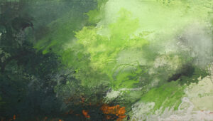
She found that the warm orange tone of the rust in tiny dots and flecks shimmering through was just the right amount to bring the sensitive green color to life.
Accentuation
In addition, she emphasized bright areas by using a subdued ash tone instead of the hard white, or she made the background appear darker in places, depending on the requirements. Finally, the artist enlivened the foreground of the pictures with runs of wet-applied, light or dark green pigment mixtures. In some compositions, she spontaneously applied the charcoal pencil to draw airy forms with loose, gestural lines that form another layer rich in contrast. Some of them are reminiscent of the outline of lancet-shaped leaves and thus incorporate the aspect of nature.
Message
Katja Gramann’s long and persistent struggle to artistically capture and adequately implement the “rejected” color green, as well as the urgent desire to give it a place in art again, led her to virtually ally herself with the color and learn to appreciate it. She also feels that green is elementary for today’s restless, unhinged times, as the color has a demonstrably calming effect on the eyes, the mind and the soul. The painter has temporarily chosen green as the color of hope and renewing life as an artistic response to the various ecological and social crises and has therefore called her new series of works “bearer of hope”.
Bibliography
Felix Thürlemann, Grün – die verstoßene Farbe. Zur Genealogie des modernen Farbpurismus. In: Rot, Gelb, Blau. Die Primärfarben in der Kunst des 20. Jahrhunderts, Hrsg. von Bernhard Bürgi, Stuttgart 1988, S. 11-27.
Eva Frodl-Kraft, Die Farbsprache der gotischen Malerei. In: Wiener Jahrbuch für Kunstgeschichte 30/31 (1977-1978) S. 89-178.
Renate Kroos, Farbe liturgisch in: Reallexikon zur Deutschen Kunstgeschichte Bd. VII (1974) S. 54-121.
Leon Battista Alberti, Della Pittura – Über die Malkunst, Hrsg. von Sandra Gianfreda und Oskar Bätschmann, Darmstadt 2002.
Wassily Kandinsky, Über das Geistige in der Kunst, Erstausgabe München 1912, Verweis aus: Bern 1973 (10. Aufl.)
© Dr. Ingrid Gardill, art historian, November 2023